Reading app
Google design sprint

Time Frame
June 2022
Duration
4 days
My Role
Product Management
User Research
Ideation and Strategy
UX, UI Design
Usability Testing and Prototyping
Team
I am the sole product designer
THE CHALLENGE
Helping parents simplify story discovery
This design sprint is based on a modified version of the Google Venture design sprint process, with research and background information provided by Springboard and Bitesize UX.
TinyTales has received feedback from parents indicating that it is challenging and time-consuming to find the right stories to read to their children from the company's extensive library. In response, TinyTales is seeking to create a solution to make it easier for parents to locate enjoyable stories to read to their children.
Scroll for the story, or jump to the solution here.
UNDERSTAND
Design requirnments

The product should be a tablet app

TinyTales needs help organizing and incorporating the inventory of stories written by contributing authors

The books should be discovered and read directly in the app
UX PROCESS
Key highlights from user quotes


" I buy lots of books to read to my kids - I'm always scanning online reviews to see what other parents have to say. I read most of the reviews to see if their children are the same age as mine, and if they enjoyed the topic."


" The main thing we look for is a specific topic that my daughter will like. Her interests change all the time though, so sometimes it takes a while to find the right story to read."

" I talk to my friends who have children that are the same age as my sons...we usually trade recommendations and it works out great."
The persona

Mom of

Kayla
4 years old

“Once we read together, I’d like it to be engaging... ..reading is important to my kids as it helps boosting their confidence”
Behaviors
Reads to children at least 3 times a week, usually before bed time.
Really values reading time and treats it as an important part of “family time”.
Knows reading to her kids is a good way for them to learn and interact.
Tries to find stories that her children will love.
Frustrations
Often spends more time looking for story to read to her kids than reading it.
Even when they find a story they agree on, Claire has to spend time quickly flipping through it to see how long it is, and if it’s written for the same age group as her kids.
It is not always easy to find a good story on a new topic or experience.
Claire spends a lot of time reading through the story beforehand to see if they are just purely for entertainment, or if there are some learning points.
Goals
Spend less time finding a great story to read to her children.
Find stories that both of her children will understand and enjoy
Be able to find stories about certain topics that her children are interested in or learned about in school.
Easily find stories that her children will find entertaining but also educational.
COMPETITIVE ANALYSIS
Learning from studying the popular players in the field
Prior to commencing any design work, I thoroughly researched various existing solutions in the market and conducted lightning demos on 3 eBook competitors (Kindle, Epic!, Barnes & Noble Nook) to understand their approaches to similar problems. I also examined websites such as Amazon that excel in categorizing and recommending similar products. From each competitor, I identified the features that were most effective in addressing the problem at hand.

Clean and simple snapshot of a book's top info

Dynamic book collections carousel elevating browsing experience

Easy to browse collections list

Effective onboarding tips

Big book covers for visual browsers

Appropriate reading level filters
LIGHTNING DEMOS
The map and opportunities
To determine the most critical problem to solve, I mapped 5 end-to-end experiences that the users may have with the app. After careful consideration, I chose to focus on the experience of browsing through categories as it has the potential to address the identified problem most effectively.

Crazy 8s
Users need a faster and more organized method of locating the most popular books. This insight inspired me to design solution screens that focus on book collections.
Through the 8 minute Crazy 8s exercise, I sketched 8 solution screens and selected one critical screen to sketch a three-panel-board of tiny storyboards.
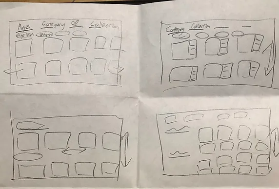
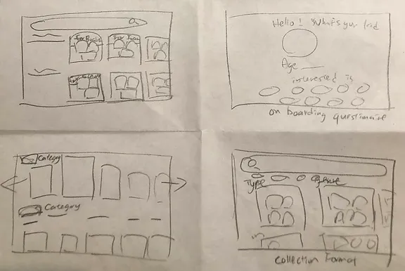
8 solution screens
Storyboard
The onboarding screen will include input components to allow user to specify their child's age and preferred topics. Ideally, the Home screen will seamlessly transition to the collections page.

VALIDATE
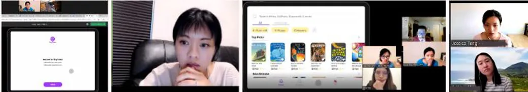
User interviews
I tested the Figma prototype with 5 users via Zoom. The users were given 3 main tasks:
1
2
3
Test results

Features Loved
Simple and short onboarding process
Mini picture previews on the book details page
Options to skip to pages and bookmark books
Big images on results page
Simplistic indication of page count and review scores

Issues
"Pre-school to 6 yrs old" is confusing because it mixes grade level and age information
The collections tab is not easy to spot
Users did not find the tile view particularly useful as the page presentation is overwhelming to browse
Users find it cumbersome to have to jump back to the search results page to favorite a book
Users would like to find a way. to quickly find books they have read or would like to continue reading.

Improvements
Changed age filter options to only grade levels
Redesigned the tab to button and icon for easier recognition
Removed tile view option
Added a favorite button inside the book details page
Included a "continue reading" section on the home page and "read again" tag on books read before.
PROTOTYPE
Key features
I designed a prototype in Figma incorporating essential features for functionality testing. The main features include:
TAKEAWAYS
Lesson learned
The home page design should be crafted with the intention of providing a personalized and memorable reading experience for returning users.
For parents of young readers under the age of 10, it is more useful to categorize books by grade level rather than age, as this better aligns with their reading capabilities and curriculum.
User research has shown that when evaluating books, users tend to initially base their decisions on book covers and follow up with reading reviews. This should be considered in the design of the home page and the placement of book covers and reviews on the page.